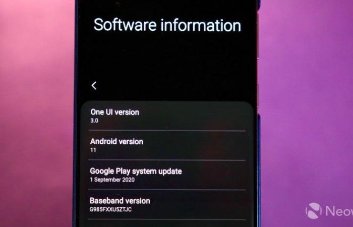
Samsung has come a long way since its early days, which took nearly six months to bring out Android updates for its flagship devices. The company quickly announced One UI 3.0 powered by Android 11 for its devices after Google released the latest version of Android. A beta program for One UI 3.0 / Android 11 for its flagship devices has also been launched in some countries.
With One UI, Samsung didn’t add many new features to its skin. Instead, the user interface has been tweaked, some system apps have been tweaked, made more compact and informative, and new icons have been used to give it a new look. Below are some of the key features of the One UI 3.0 and Android 11 for the Samsung Galaxy S20 Plus.
Optimized settings menu
The “Settings” menu has been slightly revised in One UI 3.0. The elements are now grouped a little more clearly and look more compact and more informative than before. The whole menu now looks a lot sleeker and the new icons help spice things up too.
Anpassbares Always-on-Display
Samsung has expanded the Always-on Display in One UI 3.0 with further customization options. You can now set GIFs as the background for the always active display.
Phone app updated
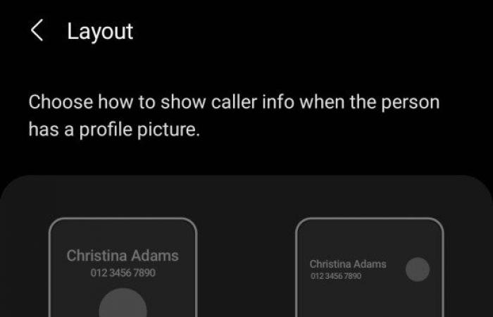
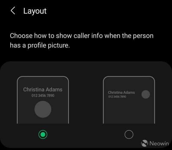
The updated phone app uses new icons and makes the action buttons under a number or contact more prominent. Samsung also allows users to customize the incoming call screen with options like using a custom wallpaper and changing the layout.
Revised notification shadow
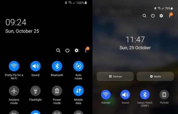
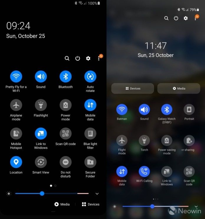
The entire quick settings panel and the notification shadow area have been completely redesigned in One UI 3.0. Samsung has done its best to incorporate the major changes Google introduced in Android 11 into the redesigned notification shadow in One UI 3.
The notification shadow is now much more compact and clearly shows all media notifications. It’s also more transparent than before, which shows the wallpaper you are using. Notifications from messaging apps are also shown separately for faster access.
Launcher updated
The standard One UI Launcher has also received a similar tweak and redesign of the user interface. Instead of a black background, there is now a transparent background for folders, app drawers, and even for Finders. In terms of new features, there is now the option to lock the device by double-tapping an empty area on the home screen.
Smarter Bixby routines
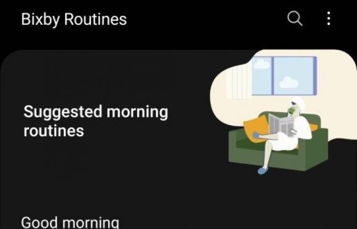
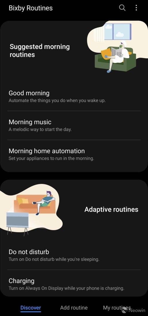
Bixby Routines was also updated as part of the One UI 3.0 update. The app itself has a clearer user interface and explains in detail what the various preset routines offer. Samsung has also added new conditions and actions to trigger actions at a specific time when the device disconnects from a Wi-Fi network or Bluetooth device, and much more. There is now also the option to add a custom symbol for each routine. New routines can also be added to the lock screen for quick activation.
Notification history
Samsung also added the useful notification history feature from Android 11 to One UI 3.0. However, the function is not activated by default. So make sure you do this by Settings -> Notifications -> Advanced Settings.
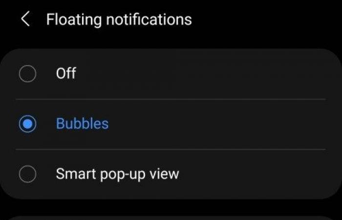
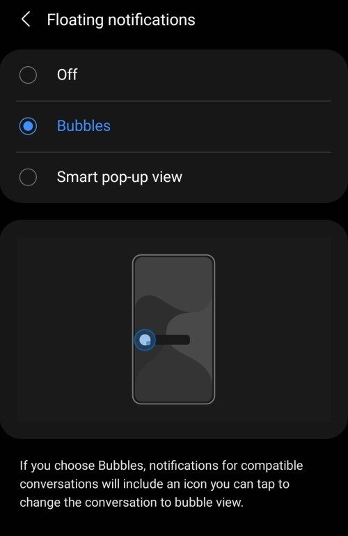
Floating notifications
Android 11’s notification bubble feature is also present in a user interface. With compatible messaging apps, you can turn ongoing chat notifications into floating chat heads so you can chat and continue whatever you’re doing. Samsung also has a smart pop-up version for this feature where you can tap a chat notification to open it in a mini pop-up view.
Smoother system animations
The system animations have been optimized again by Samsung on One UI 3.0 and feel more fluid than before. The animations are also a bit shorter, which makes it feel like One UI 3.0 is faster than previous One UI versions.
In addition, the Android gesture navigation system now works much better with third-party launcher programs. While Samsung added support for third-party starters to work with the Android 10 gesture navigation system, it was poorly implemented and buggy. With One UI 3.0, Samsung has fixed all bugs.
A 3.0 UI includes numerous other changes and features, including some that Google introduced in Android 11, such as: B. the one-time authorization for location and camera, improved camera performance, improved digital well-being with trends for the weekly report and much more.
Samsung is already running a public beta program for One UI 3.0 for the Galaxy S20 and Galaxy Note20 series. The final update for these devices should be released next month.
These were the details of the news Top features for Samsung One UI 3.0 and Android 11 for this day. We hope that we have succeeded by giving you the full details and information. To follow all our news, you can subscribe to the alerts system or to one of our different systems to provide you with all that is new.
It is also worth noting that the original news has been published and is available at de24.news and the editorial team at AlKhaleej Today has confirmed it and it has been modified, and it may have been completely transferred or quoted from it and you can read and follow this news from its main source.

