Thank you for your reading and interest in the news Five best and five worst Chelsea kits and now with details
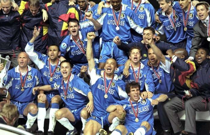
Hind Al Soulia - Riyadh - CHELSEA BEST: 5) 1997-99 home: Chelsea have played it pretty straight with their home kits, taking little risks with their traditional all-blue. This is about as adventurous they have got in the Premier League era with added white under the arms and black and yellow trim. Worn by Gianfranco Zola and Co when they beat Stuttgart to win the 1998 European Cup Winners’ Cup. Allsport
4) 2009/10 away: a rare foray into hoops as Adidas went for this smart dark blue and black number with gold trim. A season to remember all round as Chelsea became the seventh club to complete the league and FA Cup double, under Carlo Ancelotti. Getty
3) 1995/97 home: while the Umbro away kits of this period were absolutely diabolical (see worst kits), at least the likes of Ruud Gullit, Gianfranco Zola and Gianluca Vialli could run around Stamford Bridge without any shame. Clearly an inspiration for the players as Chelsea ended a 26-year wait for a trophy by beating Middlesbrough in the 1997 FA Cup final wearing this. Allsport
2) 2016/17 away: A top-notch kit from Adidas that only just missed out on top spot, unlike Antonio Conte’s title-winning side of that season. A grey/black horizontal striped top with a socially acceptable use of neon yellow (see worst kits for unacceptable). Getty
1) 2003/04 away: A classic shirt from the early Roman Abramovich days at Stamford Bridge. Money on new players was being hurled around like confetti by the new Russian owner. The likes of Juan Sebastian Veron, Hernan Crespo and Claude Makelele may not have won anything that season, but were at least attired appropriately on their travels. A simple, clean and classy all-white design from Umbro with a fade in-and-out black stripe down the middle. Getty
WORST: 5) 1992/94 away: Clearly offended so many people that this would be the last time red and white would play a dominating role in a Chelsea shirt. Not even the snazzy drawstring collar can rescue it, although made to look respectable by the top four. Getty
4) 1996/98 away: The 1990s really were a decade of shame for Chelsea away strips under the stewardship of Umbro. This number sees various shades of yellow and blue thrown together in a haphazard manner unbefitting of a club that were winning trophies home and abroad and had class acts such as Zola in their side. Allsport
3) 2007/08 away: Such is the strength in depth of appalling away kits, this neon yellow retina-shredder finds itself down in a surprising third place for the Blues. Sport is about small margins. I firmly believe the mental anguish brought on by their away kit caused Chelsea to finish second in the Community Shield, League Cup Premier League and Champions League that season. Probably. Getty
2) 1990-92 away: A cracker of a top-two clash from the London club here. A narrow defeat for this Umbro shocker but still a mighty fine terrible shirt. A red-and-white diamond effect that is more at home on a picnic blanket than football pitch. Getty
1) 1994/96 away: Not just Chelsea’s worst ever kit, but one of English football’s most abysmal efforts of all time. “I think a mix of greys, orange and dark blue would look good on a strip,” said no one, ever. Unforgivable. Allsport
These were the details of the news Five best and five worst Chelsea kits for this day. We hope that we have succeeded by giving you the full details and information. To follow all our news, you can subscribe to the alerts system or to one of our different systems to provide you with all that is new.
It is also worth noting that the original news has been published and is available at The National and the editorial team at AlKhaleej Today has confirmed it and it has been modified, and it may have been completely transferred or quoted from it and you can read and follow this news from its main source.

