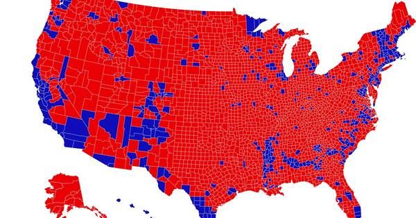

Those who followed the US presidential election cannot have escaped notice: the map of the United States, divided into the so-called ‘red’ and ‘blue’ constituencies. It is less well known that these traditional maps give a distorted picture of the political color of the Americans. That is why Karim Douïeb from Brussels developed an alternative, which is now going viral again.
RL
06-11-20, 23:25
Latest update:
23:51
Source:
Twitter, FastCompany, Karim Douïeb
Data scientist Douïeb found a card with the results of the presidential elections in 2016 last September. It was shared on Twitter by Lara Trump. He wanted to encourage her father-in-law in the run-up to his possible impeachment trial. On the largely red card (the color of the Republicans), it seems as if the Americans voted en masse for Donald Trump in 2016. However, it was Democrate Hillary Clinton who received the most votes in 2016.
However, that is not visible on the map below. And that is why Douïeb speaks of “a completely wrong representation of the data”. The data scientist, who says he is not very politically involved, “could not fail to correct this visual error,” he said in an interview with news medium FastCompany.
Douïeb, co-founder of Jetpack.AI, a company specializing in data display, is certainly not the only one who is disturbed by the traditional election maps. The card has been a thorn in the side of specialists in data display for years. After all, the map says more about area than the number of votes: an electoral district with a large area and few voters is more visible on these types of maps than a smaller district with many voters.
Because in the US, Trump voters generally live in large but sparsely populated constituencies, while the Democratic constituency mainly lives in smaller but densely populated constituencies, the Republican votes are visually overrepresented.
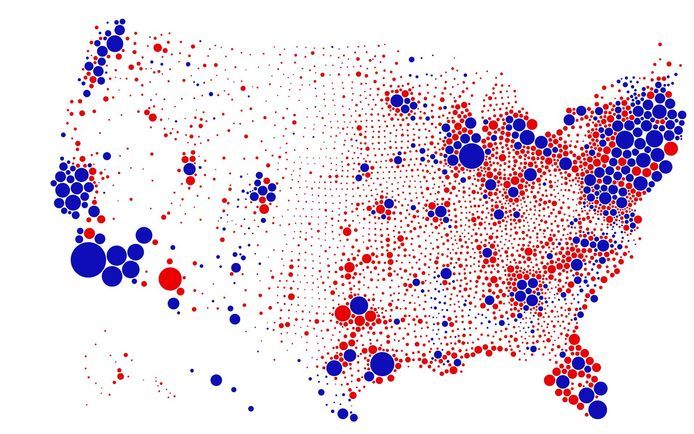
That’s why Douïeb created a map that offers a “much more accurate reading of the situation”. Rather than simply coloring the constituencies red or blue, depending on who had the most votes in a particular state, he chose a different method. He made circles based on the actual number of Democratic or Republican votes in a constituency, which produced a completely different – but more realistic – picture. The map below immediately became a hit on Twitter, which resulted in thousands of new followers and likes for Belgians.
Although the map is now a year old and relates to the 2016 elections, it is also now going viral. In election time it shows at a glance how misleading traditional cards can be. Because again, many media out of habit choose maps that give priority to the geographic area of a constituency instead of the number of voters.
As a result, in 2020 it again seems as if the overwhelming majority of Americans voted for Republican Trump, while it is the Democratic presidential candidate Biden who will get the most votes this year.
Hillary Clinton has a say in the fact that the latter in the United States is no guarantee of winning for the presidency. However, Douïeb’s map cannot change that.
Also read:
White House can no longer escape Biden, but official result may not be until December 14 (+)
Our opinion. There is a conspiracy against Trump. Her name is: democracy (+)
Free unlimited access to Showbytes? Which can!
Log in or create an account and don’t miss out on the stars.
Yes, I want unlimited access for free
These were the details of the news The American election map is fooling us, but a Belgian offers... for this day. We hope that we have succeeded by giving you the full details and information. To follow all our news, you can subscribe to the alerts system or to one of our different systems to provide you with all that is new.
It is also worth noting that the original news has been published and is available at news1.news and the editorial team at AlKhaleej Today has confirmed it and it has been modified, and it may have been completely transferred or quoted from it and you can read and follow this news from its main source.


