Thank you for your reading and interest in the news Five best and five worst Manchester United kits and now with details
Hind Al Soulia - Riyadh - MANCHESTER UNITED BEST: 5) 1992-94 third kit: I hold my hands up here, this is allowing heart to rule over the head. A half-and-half yellow and green top feels wrong and even the Gallic flair of Eric Cantona or good looks of Lee Sharpe could not pull it off. But the colours - first worn by Newton Heath, the club that would go on to become Manchester United - have since been adopted by fans to protest about American owners the Glazers and so this is handed an emotive free pass out of worst kits. Getty
4) 1996/97 home: A fine United home kit from Umbro, with faded white to black collar, badge moved to middle of the strip and smart dark patterns on the arms. A strip that inspired a young David Beckham to score from the half-way line against Wimbledon at Selhurst Park on the opening day of the season. Getty
3) 2018/19 away: A turbulent season for the club, as moaning Jose Mourinho’s reign as manager came to an end and the team’s home kit disgracefully flouted club traditions (see worst kits). But this subtle pink number from Adidas at least provided some respite during troubled times. Getty
2) 1994-1996 home: Another wonderful home shirt that is only kept off the top spot by an absolute belter. This is Cantona back from his ban for kung-fu kicking a fan with his collar raised up and ruling the Premier League. Even Steve Bruce and his bent nose looked good. Umbro’s call to have an image of Old Trafford imprinted onto the shirt was a genius one. Allsport
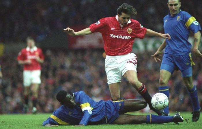
1) 1992-1994 home: One of the all-time great football kits. Everything about this Umbro effort screams class; from the lace-up collar to the black and red socks. The days of tiny shorts were also rightly coming to a close as United adopted an old-school longer length with attractive red pattern on one side. As United won the inaugural Premier League season - their first top-flight title in 26 years - they also produced a game-changing fashion item. Allsport
WORST: 5) 2009/10 home: A stain on the fine traditions of United home kits. The weird black arrow across the top points to the floor and it’s certainly a thumbs down for this Nike blunder. Getty
4) 2018/19 home: Dark times for United and an act of sacrilege committed here from Adidas. All seems fine and dandy at the top of this strip until black stripes appear across the top’s midriff before trampling all over club tradition by substituting white shorts ... FOR BLACK ONES. Such was the shock of this treachery that it sent manager Jose Mourinho into his miserable ‘Emo phase’ before being sacked. Getty
3) 1994-96 third kit: A variety of blue designs dominate United’s top three. Slight echoes of the infamous Brighton debacle from a couple of years earlier with a blue and white striped top and matching shorts combination. Stripes on shorts … honestly. Allsport
2) 1992-93 away: Another shocker from Umbro. This all blue effort is covered with a black kind of tie dye pattern and finished off by a ludicrous over-sized United badge. Alamy
1) 1990-92 away: An infamous abstract eyesore from the start of the 90s. Another one of these hideous old kits that has apparently now gained a cult following. But, let’s be honest, good things rarely come out of joining a cult. Getty
These were the details of the news Five best and five worst Manchester United kits for this day. We hope that we have succeeded by giving you the full details and information. To follow all our news, you can subscribe to the alerts system or to one of our different systems to provide you with all that is new.
It is also worth noting that the original news has been published and is available at The National and the editorial team at AlKhaleej Today has confirmed it and it has been modified, and it may have been completely transferred or quoted from it and you can read and follow this news from its main source.

